
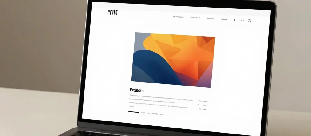
A generous margin makes a portfolio page feel quieter, but quiet is not the same as clear. If the project title, image, and next action all compete—or disappear into the space—the layout is not doing its job. I use whitespace to guide attention, not simply to make a page feel minimal.
Give Each Element A Role
On a project card, the image can establish the visual world, the title can name the work, and a short description can tell someone why to open it. When each part has a distinct job, there is less need to crowd the card with extra labels or decoration. The space between elements helps those roles read separately.
I also check the page at the size people actually use. A gap that feels elegant on a large monitor can make a mobile page feel like it has lost its rhythm. Adjusting spacing across screen sizes is part of the composition, not a cleanup task.
Make The Next Step Visible
A little motion can help make a button or project link feel responsive, but it should not make the reader wait to understand what is clickable. I prefer a restrained change in color, underline, or position over an effect that competes with the work. The interaction should confirm the choice, not become the main event.
A useful test is to step back and ask what the eye lands on first, second, and third. If the path from project card to case study is obvious, the whitespace is supporting the content. If it is not, reducing space is only one possible fix; clearer hierarchy may be the better one.